Website design is ever-evolving, and part of that is because how we view websites is constantly changing. According to the Global Web Index, 80 percent of people in the states view the internet on their phone. Additionally, 47 percent surf the web on their tablet, and 37 percent use their game consoles. Using a PC or laptop is still the most popular way at 91 percent, but new technologies such as smart televisions and smart watches are also becoming new platforms for people to search the internet.
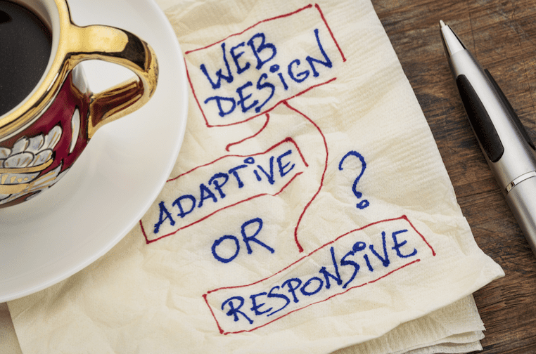
What this means for website design is that you have to come up with design techniques that best benefit the user’s experience with any given website. Two of the more prominent website design choices have been responsive design and adaptive design. They sound like synonyms for one another, but they offer different approaches to how someone should experience a site.
Responsive Design
Responsive websites are flexible and fluid, and they respond to the size of your web browser. So for example, if you have your browser open at full screen on your laptop but then minimize the screen to only half of your desktop, you’ll see the website resize along with your browser.
Adaptive Design
Adaptive chooses static layouts over a responsive website design approach. Adaptive design detects what size your browser is at, and it’ll load the layout it believes is the best fit for your browser size. Traditionally, adaptive design layouts have about six adaptive layouts for the six most common screen widths. So for example, if you have your browser’s width at 320, the adaptive design will load its layout for that screen width; and if you expand that screen width to 1200, the adaptive layout will then load its design for that size. The design will only adapt to a new layout when the browser hits specific widths.
Which Design Should You Use?
You generally have more control over what your website looks like with adaptive design because you’re deciding how users experience your website at any given size. With responsive, the user gets to view the site how they please, but this usually makes more work for your website design strategy because you’ll have to consider every type of layout size a user could put your website through.