Having your own little corner of the Internet in today’s day and age is all the rage. Whether it be for personal or entrepreneurial reasons, maintaining an eye-popping, up-to-date website is essential for not only attracting digital audiences, but for keeping them there once they’ve arrived.
That being said, if you’ve spent any amount of time either building a website or working as a web design specialist, you know that attracting audiences is a task easier said that done. If you’re intent on constructing a site worthy of widespread approval and traffic on the World Wide Web, there are a handful of mindless mistakes that should be avoided at all costs:
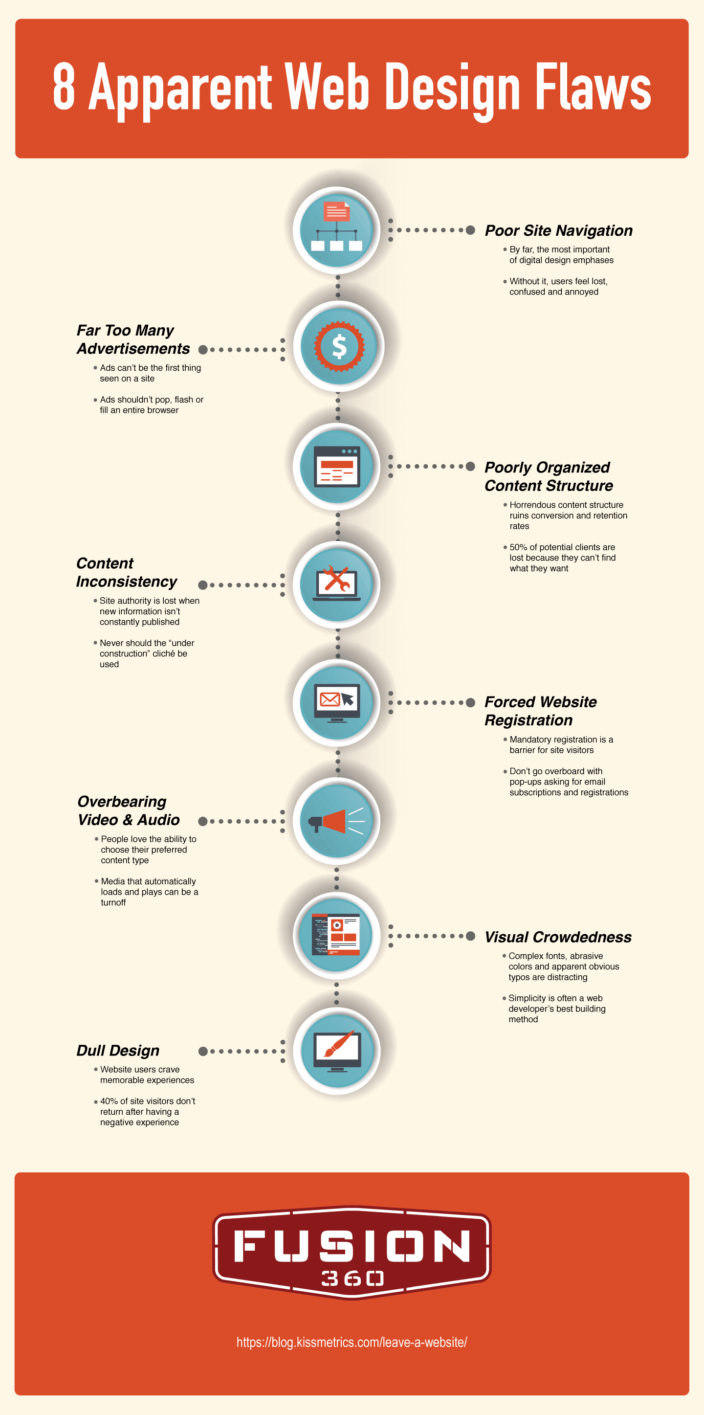
1) Poor Site Navigation
Few things are as frustrating for Web enthusiasts as poor site navigability. Customers shouldn’t ever feel confused or annoyed at what a website offers them. Far too often do web design specialists—even those with years of experience—provide visual elements which are difficult to interpret or scatter main navigation links all over a homepage. If such feelings arise because a user can’t quickly find what’s being searched, it’s unlikely that he or she will ever return.
2) Far Too Many Advertisements
This is more of an issue for bloggers and digital publication sites, but it’s still something that shouldn’t occur. While your site might rely on ad revenue to stay afloat or pull a profit, there’s no reason to bombard visitors with unending advertisements, many of which are difficult to exit out of. Never allow for ads to be the first thing that a user sees or for them to take up more room than your actual content does. Furthermore, and of extreme importance, pop-up ads can’t cover up the very information your guests are hoping to consume. With ads, the more discreet the better.
3) Poorly Organized Content Structure
More often than not, when conversion and retention rates suffer, poor content structure is somehow involved. In fact, it’s estimated that upwards of 50 percent of digital sales are lost when potential customers can’t easily find what they’re looking for online. Keep things simple, especially with your site’s content layout. If information can be presented on a single page, allow it to happen. Truthfully, this sort of problem presents a quick fix. Bold headings, introductions and highlighted keywords do more for enhancing content structure than just about anything else.
4) Content Inconsistency
Ever thought that you’d found the perfect site for what was needed only to realize that the site’s content was last updated four or five years ago? Though potentially accurate, inconsistent publishing is a huge deterrent for Internet users. If writer’s block has you at a loss for words, consider adding a blog to your personal web domain. Blogs are great for updating visitors with the latest information, news and interest-specific trends. Once the proper balance between interactivity, design and content production, has been discovered, the clicks come pouring in.
5) Forced Website Registration
These days, it seems like personal information is given out on a daily basis. Whether it be the creation of a new social profile or a rewards card at the grocery store, everyone wants access to your email address. It’s for that exact reason that people are hesitant to hand over personal information. If possible, allow visitors to register for site access without being hassled. When unavoidable, at least give users a taste of what they’re about to sign up for.
6) Overbearing Video & Audio
People love options. For experts of web design, this is a pivotal part of any design strategy. Speaking of the power to choose, reports KissMetrics.com, “Most people value their ability to choose what content to absorb. Having video or audio that loads automatically can potentially drive visitors away.” Audio and video are both excellent for keeping visitors on your site. With that in mind, however, when automatically loaded and implemented, dissatisfaction often ensues.
7) Visual Crowdedness
Visual discomfort doesn’t only come about when images and videos overload a page; unusual fonts, abrasive colors and obvious typos all play their respective roles in giving any visitor an unpleasant experience. Ideally, if the budget is there, a web design professional should be contacted for additional help. Seeing as how color palette, typeface and site tone can have a tremendous impact on customer conversion rates, it’s key that the best that the industry has to offer be consulted.
8) Dull Design
The entire purpose of a website is to feed valuable messages to earnest seekers of knowledge. If a site is dull, that end goal is hindered in its efficiency. At the end of the day, memorable moments are what bring people back to a site, time and time again. Yes, it’s true that minimalistic websites can be both beautiful and engaging, but when built improperly, they’re more an eyesore than anything else. Even worse, when tragically coupled with weak content, it’s literally impossible that a web domain succeed.
Whatever your specific design needs might be, heavy traffic is going to make the necessary time and effort required for building an incredible website worth the hassle. Needless to say, when the aforementioned design catastrophes are consciously bypassed, websites flourish.